
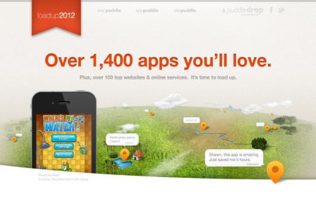
I really like this large feeling format. The informational areas look almost oversized but are comprised of screenshots mostly and other info-graphic like things. Nicely done and it’s easy to scan and take in quickly even though it’s long and scrolls so much. Great work!




0 Comments