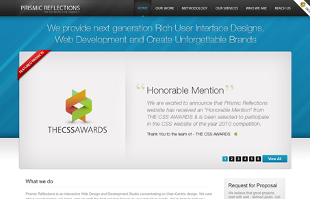
There’s a lot to this design that you see on other sites, but this one is executed nicely as well as looks good. I particularly love the extra effort that’s put into the main large image area that showcases recent work on the home page. That’s like a mini site design in it’self. Good stuff.
Glassmorphism: The Transparent Design Trend That Refuses to Fade
Glassmorphism brings transparency, depth, and light back into modern UI. Learn how this “frosted glass” design trend enhances hierarchy, focus, and atmosphere, plus how to implement it in CSS responsibly.


0 Comments