Prime Minister Office of India

http://pmindia.gov.in/

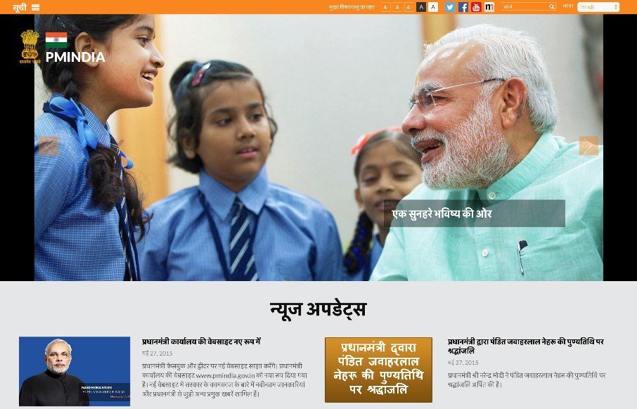
I don’t think when I started writing for Unmatchedstyle, that I thought I would be reviewing the Prime Minister of India’s website – but here it is.

From what I can tell from his site, PM Narendra Modi seems like a hip and with it leader – a good bridge between India’s past and future (I have no political views, just taking in what I see and read from the site). I think the site designers have done a good job in showing that in the imagery, the content, ties to social media, and in some subtle aspects of the site’s accessibility – it plays well towards older and younger audiences in other words. (Most government sites are horrible – all across the world – and finding a balance between making sure your older audience can access the site, and your younger audience cares about the site, and subsequently what is going on in their government – that balance is essential on government sites – they’ve found it here.)

@PMOIndia

0 Comments

Submit a Comment

Your email address will not be published. Required fields are marked *

News & Articles

Sign-Up: Enhancing Conversions through good UX

Sign-Up: Enhancing Conversions through good UX

Optimize your website’s sign-up process by focusing on clarity, ease, and user mindset. Clearly explain the purpose, benefits, and steps, and use social proof to build trust and drive conversions.

The Essential Guide to Getting Started on Freelance Writing

The Essential Guide to Getting Started on Freelance Writing

Explore the lucrative and fulfilling world of freelance writing with our essential guide. Learn about specialties like blogging, social media, article, and technical writing. Build a portfolio, find work, set up your business, and discover the potential earnings. Embrace the freedom of working from home and follow tips for success in your dream career.