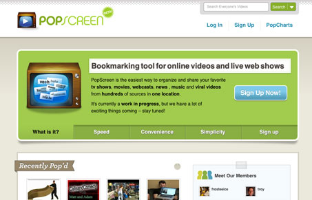
PopScreen is a bookmarking tool for online videos and live web shows. We empower users with a simple set of tools to collect, organize and share all their favorites in one location.
This design is straightforward and easy to take in. The call to action is pretty well displayed in the main slideshow area. I would like to see it that visible even when you move off the main slide in that main image area though. Overall the site is broken into two sections the top half and bottom half respectively. I like how that’s working in regards to the content display.
There are some extra little details that are pretty neat on this site too. The search has some sub categories you select from a nifty drop down selector and there is a cool looking and very subtle clock-like display that makes the recent videos switch out to an updated list. It’s little things like this that will just make your site scream that it’s “a great app and you need to use it.”


0 Comments