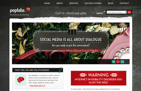
Good thorough website design, from top to bottom this site is put together well. The content is very well organized and deep. The site sports a nice blog too (good read). I really like the “diagnosis” form/app they’ve got going off the home page, that’s just clever. The stalk us down at the bottom is fun and I think really appropriate placement for those social networking icons.
Glassmorphism: The Transparent Design Trend That Refuses to Fade
Glassmorphism brings transparency, depth, and light back into modern UI. Learn how this “frosted glass” design trend enhances hierarchy, focus, and atmosphere, plus how to implement it in CSS responsibly.


0 Comments
Trackbacks/Pingbacks