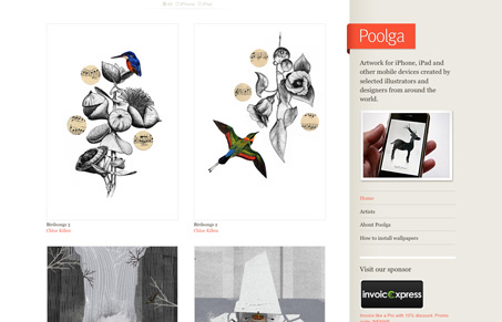
I love this blog layout. It has wonderful content and it’s just so simple and straight forward you can’t help but like it. I like how it goes from 4 large images to smaller sized ones based on when they were added. It feels a lot like ffffound.com but with a little more love spent on the visual design.
Glassmorphism: The Transparent Design Trend That Refuses to Fade
Glassmorphism brings transparency, depth, and light back into modern UI. Learn how this “frosted glass” design trend enhances hierarchy, focus, and atmosphere, plus how to implement it in CSS responsibly.


0 Comments