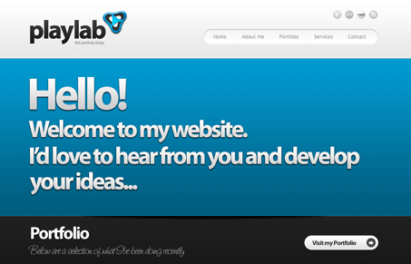
I like the almost 3D elements used across this site, the main type looks really crisp too. The portfolio is fairly extensive too, with the full screen website images, very nice.
I also like that this site is multi page, I thought it was a single page jQuery website at first viewing and was pleasantly surprised when a new page loaded for me.


I agree with Gene but have one small note: I think he should rethink the tiny facebook and Linkedin icons and change them to just letters rather than spelled out. They are soooo tiny.