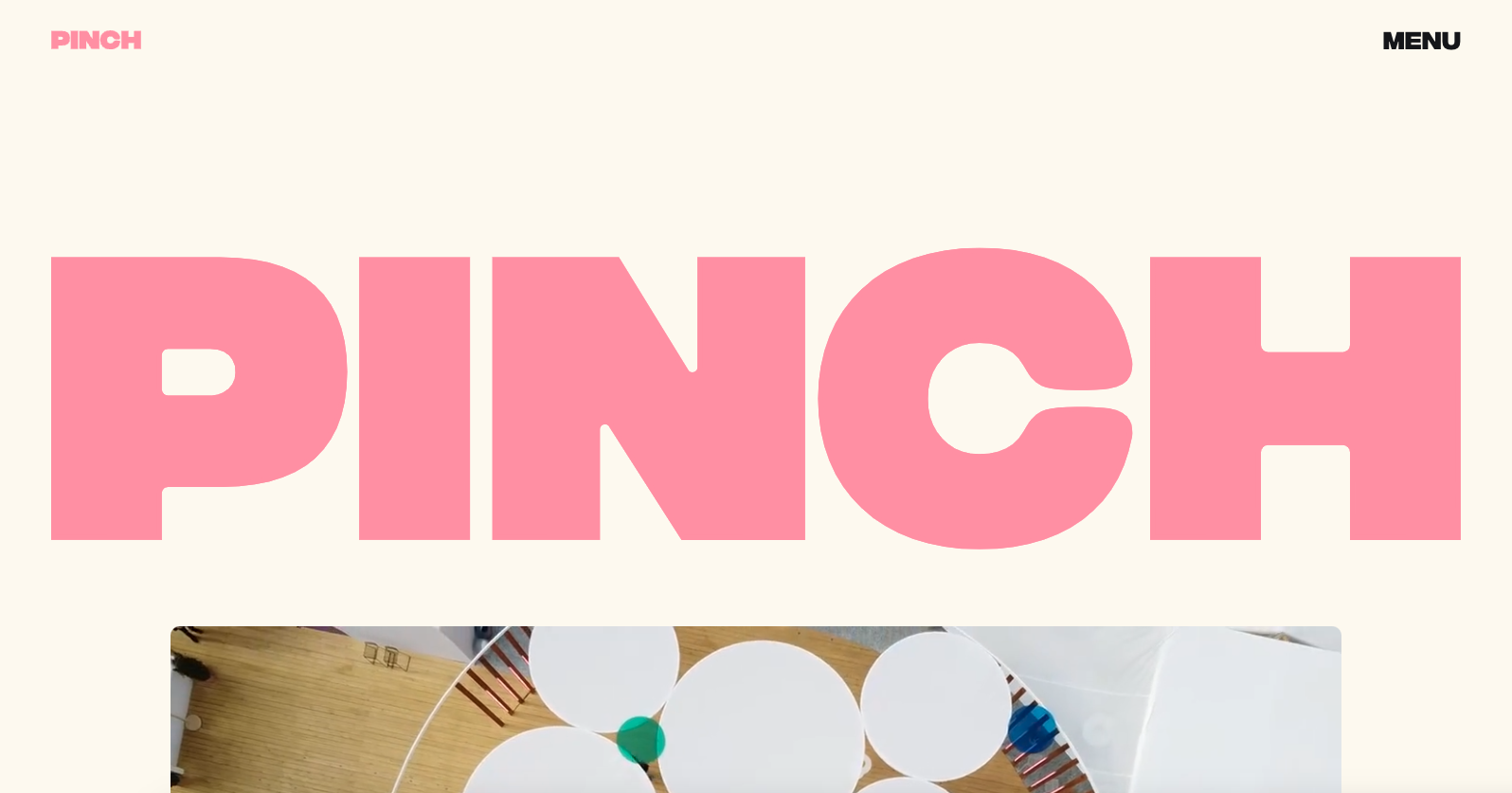
This website design just radiates it’s boldness with the bubblegum pink coloring. This audacious choice of color scheme not only catches the eye but also injects a sense of vibrancy and creativity into the digital space. Furthermore, the multicolored screen transitions serve as a delightful and dynamic addition, enhancing the overall user experience and reinforcing the studio’s creative prowess.


The Call to Action, Revisited
The Call to Action hasn’t changed in a decade, but the bar has. A fresh look at prominence, copy, mobile tap targets, and accessibility, with lessons from three major design systems.


0 Comments