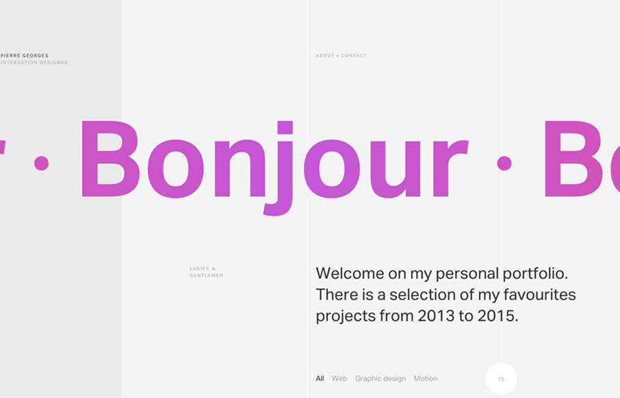
Super sleek grid based layout. I love that he’s using the grid visually and structurally. I also love the way it plays with the typography and then the interactions feel perfectly placed. The layout of the work samples get kind of tedious as you scroll down the page, mainly because there’s so many of them, the details still look gorgeous though.
Glassmorphism: The Transparent Design Trend That Refuses to Fade
Glassmorphism brings transparency, depth, and light back into modern UI. Learn how this “frosted glass” design trend enhances hierarchy, focus, and atmosphere, plus how to implement it in CSS responsibly.


0 Comments