petincanvas.com

petincanvascom

Submitted by Tony Tao, @2pxb. Designer.

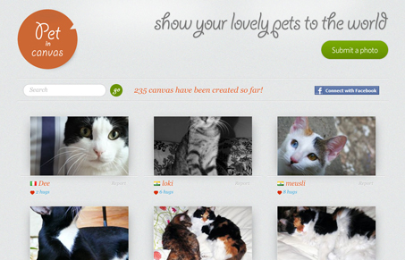
Simple three column layout of pictures, but there’s some really nifty javascript stuff here. The tool tip when you hover over a picture and the way it slightly zooms in give it a really nice animated feel. I really like the simplicity in the layout and type. The logo and button for submissions looks good. I love the submission form, the instructions displayed to the right on interaction with each form field is very very nice.

0 Comments

Submit a Comment

Your email address will not be published. Required fields are marked *

News & Articles

Sign-Up: Enhancing Conversions through good UX

Sign-Up: Enhancing Conversions through good UX

Optimize your website’s sign-up process by focusing on clarity, ease, and user mindset. Clearly explain the purpose, benefits, and steps, and use social proof to build trust and drive conversions.

The Essential Guide to Getting Started on Freelance Writing

The Essential Guide to Getting Started on Freelance Writing

Explore the lucrative and fulfilling world of freelance writing with our essential guide. Learn about specialties like blogging, social media, article, and technical writing. Build a portfolio, find work, set up your business, and discover the potential earnings. Embrace the freedom of working from home and follow tips for success in your dream career.