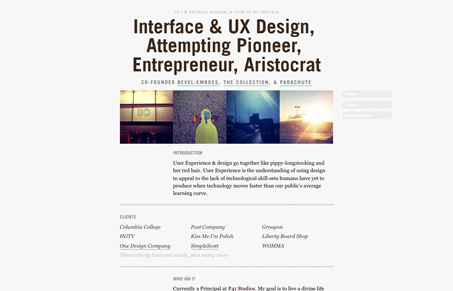
I like the concept of this site, it’s a good way to get a real brief overview of what Patrick is all about. It’s straightforward and to the point. “I do this, I’ve done this, etc..” It’s hits the right points but I’m not sure about the tone. When you have good work, like Patrick does, sometimes it’s better to let that do the talking.
Glassmorphism: The Transparent Design Trend That Refuses to Fade
Glassmorphism brings transparency, depth, and light back into modern UI. Learn how this “frosted glass” design trend enhances hierarchy, focus, and atmosphere, plus how to implement it in CSS responsibly.


I have nothing against the design of the site. The main negative that I see is that with javascript turned off, you get absolutely nothing but a blank page. Even though only 5% of users have javascript turned off for whatever reason, some level of usable degrading would be advisable.
OK, sorry to be negative but me being a web usability evangelist and noscript (Firefox addon) user I’m very, very disappointed that this site isn’t usable AT ALL without JavaScript (but CSS enabled). OK, as a user *experience* designer, one probably isn’t all that much concerned about (or proficient with) how the really basic things are usable under minimal conditions for the not so blessed folks out there but yet, this is an unacceptable condition. And I understand that unmatchedstyle is more focusing on the graphic design aspects but clearly, since we’re talking about websites here we shouldn’t forget about the most basic usability a website should provide (to fall under the category “well done”).
I think it’s a relatively easy fix since the HTML is OK but the styling is relying on JavaScript and without it the site becomes unusable. Currently it looks like the site is only about the fancy effects, not primarily about delivering content/information and some of the sites behind the links there also look like the user “experience” is more important than the content. That’s a big fail in my eyes.
Other than that, once I’ve allowed all scripts etc. the minimalist design is really nice and I agree about rather letting the references do the talking.
I think you guys bring up a legitimate point, I didn’t even think to turn off javascript because I saw nothing that ‘fancy’ about it. I see now that it fades in when the site loads, and the main div is set to ‘display: none’ in the css. This is a really bad idea since it causes the site to be totally inaccessible if javascript is turned off. This is a very easy problem to avoid and that fade in effect is definitely not important enough to render the site inaccessible for some people.