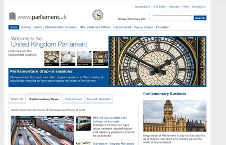
This is one of the best “federal” type government websites i’ve ever seen. There’s so much going on here content wise it’s crushing and yet this layout let’s you peer right into it with ease. One thing that’s blowing my mind is that whomever designed this, got away with not using a fly-out navigation scheme!
There’s so much you could go through with this site, i’ll just mention my favorite part. The section from the header to below the blue shape that holds the main images. That’s such a clean area of design that packs such a punch of information, I can’t help but love it. The clock, that looks like an analog clock, is a very nice touch.


0 Comments