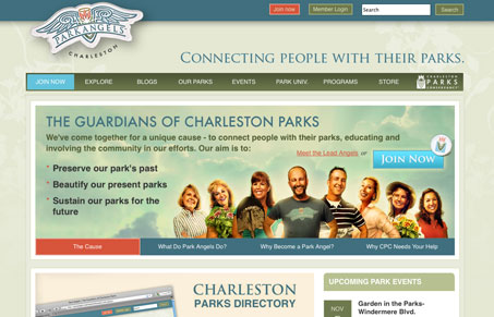
This site has the makings of a great online community with all the functionality, resources and interaction you could ask for. At first the design is a little bit busy with lots type asking for my attention – maybe the typography could be tightened up a little?
Other than that it’s a clean, well organized site with earthy but cheery colors. Also, I always appreciate some custom photography.
They did a great job of answering the main questions a visitor would have about their site right there on the homepage. I also enjoyed the clean and simple join form – too bad the donation one is hosted off-site. All in all, well thought out and well executed.


I agree Julia, this is a pretty good looking design. I especially like the subtle background stuff, it’s almost unnoticeable but really ads some richness. I also really like the footer area, the three images and the way the spacing is done is very nice.
Thanks for the positive feedback guys. It was a fun project to work on. Park Angels already had a beautiful brand and we were able to carry that over to the web. Building the community online brought a lot of challenges but we are excited about the end product.