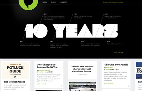
The digital agency previously known as Paramore|Redd celebrates 10 years of creating stellar work in style. To help mark their anniversary they launched a new site, branding, and overall reinventing. Word on the street is that they spent almost a year on the new Internet digs and I’d say it’s a great success. The site is bold and full of personality. Each page is uniquely crafted and well thought out. Strong type, color, and good-looking photography really give the site some classy punch. Despite all the nice little finishing touches like the expanding nav or dynamic blog categories, the site still represents their motto well: “Simple. Clear. Focused on Results.”
It’s a slick site all around and some of the best copy I’ve ever read on the Web. All this and a whole section devoted to their office “bitches.” That’s some serious Interweb awesomeness.
Review by: Maria Frey
@mariafrey | mariafrey.com


Interesting how they did the timeline on the front page.
I thought that was flash at first myself.