Submitted by Kyle Hildebrant, @hildebrant. Designer.
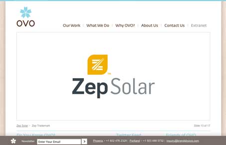
Nice clean design, with a subtle grid at work. The large image in the top of the site is fairly consistent across sections and the typography is also consistently well done. The fixed footer for the email signup is a good idea too, it’s a simple thing they want you to do and having it setup that way keeps it out front. I like the arrow interactions on the main slide show area too, the on, over and click states are all different enough and work really well.


Thanks for the review of the site. Glad you liked it.
Cheers,
@Hildebrant