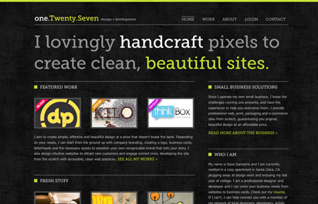
Damn I love museo, I promise this isn’t the only reason this site made it into the gallery. I do love the background’s subtle texture and the colors are very nice. I love that particular green. The little javascript extras are really nice too, not too much either. One thing I do wish is that it really stuck to the grid across the entire page, from the header to the footer. Really great looking site here!
Glassmorphism: The Transparent Design Trend That Refuses to Fade
Glassmorphism brings transparency, depth, and light back into modern UI. Learn how this “frosted glass” design trend enhances hierarchy, focus, and atmosphere, plus how to implement it in CSS responsibly.


0 Comments