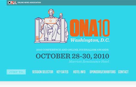
Really cool teaser page for the next ONA conference. It’s one long single pate and it really works. After all it’s a teaser style page but packed with info. I like the banded dark(ish) to light bands for the sections and typography is pretty good. It gets a little difficult to read in certain spots due to low contrast on the type but overall a really nice site design.
Glassmorphism: The Transparent Design Trend That Refuses to Fade
Glassmorphism brings transparency, depth, and light back into modern UI. Learn how this “frosted glass” design trend enhances hierarchy, focus, and atmosphere, plus how to implement it in CSS responsibly.


0 Comments