oca.org

ocaorg

Submitted by: JD Graffam @jdgraffam
Role: Creative Director

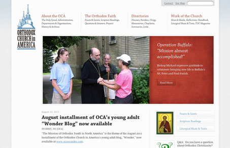
Ooh, responsive! And so pretty!
John Mears, of Simple Focus, was the hands-on designer and developer.

Church sites in the past are usually cited as being less than attractive. This one not only crushes that stigma, but it’s beautifully responsive to boot. The layout and type has a very clean and modern feel, yet still engaging. I think the bits of color and texture add to that warmth. Overall it’s a really nice looking site that’s anything but what you might expect.

0 Comments

Submit a Comment

Your email address will not be published. Required fields are marked *

News & Articles

The Essential Guide to Getting Started on Freelance Writing

The Essential Guide to Getting Started on Freelance Writing

Explore the lucrative and fulfilling world of freelance writing with our essential guide. Learn about specialties like blogging, social media, article, and technical writing. Build a portfolio, find work, set up your business, and discover the potential earnings. Embrace the freedom of working from home and follow tips for success in your dream career.