Obox Design

obox-designcom

Submitted by David Perel, @obox. Designer.

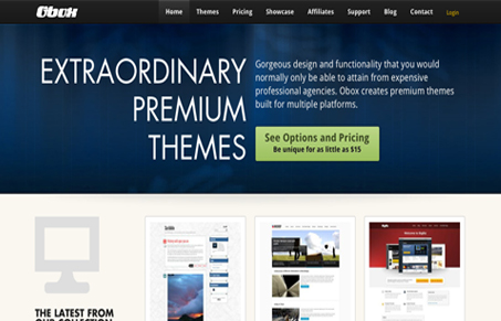
Our main focus for the new site was to make it lighter than the older version and easier to navigate and shop.

I suppose I could go on forever but I will just link you to an overview (if/when you have time to scan it)

I can’t really bring more justice to this review than what the guys did here with their overview post, it’s quite thorough and deftly shows you the attention to detail Obox puts into all their work.

I simply love this site (BTW the themes are awesome as well!). There’s a lot of detail in this website, showcasing all the theme designs in a way that really shows off the work is hard to do, they’ve done it. I also love the pricing page design, that had to be tricky content wise too.

Great site, great themes. Love Obox’s work!

0 Comments

Submit a Comment

Your email address will not be published. Required fields are marked *

News & Articles

Sign-Up: Enhancing Conversions through good UX

Sign-Up: Enhancing Conversions through good UX

Optimize your website’s sign-up process by focusing on clarity, ease, and user mindset. Clearly explain the purpose, benefits, and steps, and use social proof to build trust and drive conversions.

The Essential Guide to Getting Started on Freelance Writing

The Essential Guide to Getting Started on Freelance Writing

Explore the lucrative and fulfilling world of freelance writing with our essential guide. Learn about specialties like blogging, social media, article, and technical writing. Build a portfolio, find work, set up your business, and discover the potential earnings. Embrace the freedom of working from home and follow tips for success in your dream career.