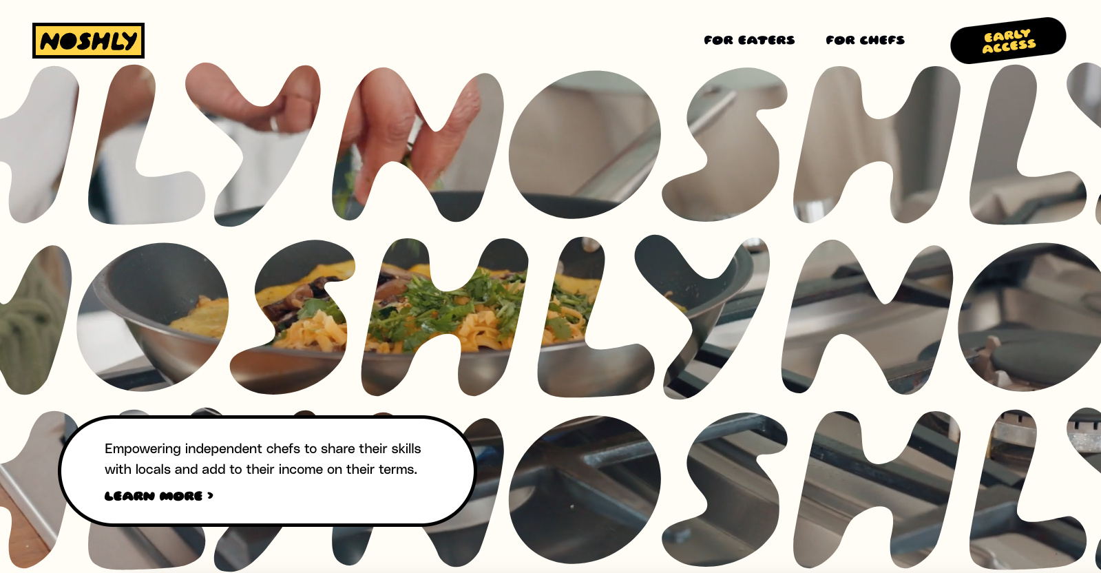
Noshly’s website for their new app looks cool! It has round boxes and bright, colorful colors like candy. But the best part is the video with their logo on it. It’s like magic! Even though it seems simple, it makes the website look awesome and fun. It shows that even little changes in design can make a website super cool and exciting.


The Call to Action, Revisited
The Call to Action hasn’t changed in a decade, but the bar has. A fresh look at prominence, copy, mobile tap targets, and accessibility, with lessons from three major design systems.


0 Comments