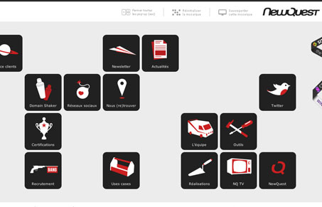
newquest.fr takes visual dynamics seriously. A strong modular grid with random focal points that change every time the browser window is resized, ensure (for the most part) that all the content is available all the time. The content location is completely randomized, even the modal content views are placed randomly when they pop up. I find it interesting to just resize the window a few pixels just to see the new random layout of elements.
In some ways newquest.fr seems to get everything wrong: It doesn’t use flash but has created very ‘flash-like’ interaction and dynamics. UI is difficult to become accustomed to because locations constantly change. You have to hunt for everything that you want. To some extent, I think they are just bucking the system and going their own way, which is great, and many of the potential problems are mitigated by interesting icons and a straightforward visual language.
The aesthetic is stark and digital and pairs well with the extensive dynamism built into the interface. Though the design employes a overwhelmingly strong grid, the whitespace between the randomly spaced elements creates an interesting organic quality. Rivers of whitespace, on might say. I do find it a bit hard to use but interesting to behold.


0 Comments