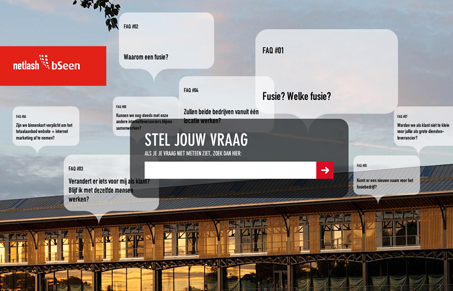
Netlash-bseen.be is a site which attempts to answer questions users and customers might have concerning a merger of two belgian companies. So basically it’s an FAQ. But they really went out of their way to make something inventive and interesting out of something that otherwise could be boring and more than likely unnoticed or unused. I don’t know the history or news surrounding this merger, but an eye-catching and creative site like this is a good way to actually get people to see some of these issues and more importantly act as a diversion to whatever confusion or controversy surrounding it.
Glassmorphism: The Transparent Design Trend That Refuses to Fade
Glassmorphism brings transparency, depth, and light back into modern UI. Learn how this “frosted glass” design trend enhances hierarchy, focus, and atmosphere, plus how to implement it in CSS responsibly.


nice work, nice technology … and presenting the right message + answers to the visitors
It seems to attract attention : people are getting curious and want to see more …
Nice work!
This is how websites should be build!!
The website brings its message in an original way. Nice work!
Inventive, playful and in the same time totaly equipped for its purpose. Lovely.
When I see this high a number of positive comments and this low of a ranking, I have to wonder just what exactly is happening here…
That’s what we at unmatchedstyle call, gaming the rankings…
I believe that cookie based voting is the root cause. Netlash-bSeen has quite a few haters and if the system can be played, it WILL be played.
About a week ago the score was over 7…
So tell me a little more about them? Why do they have haters like that?