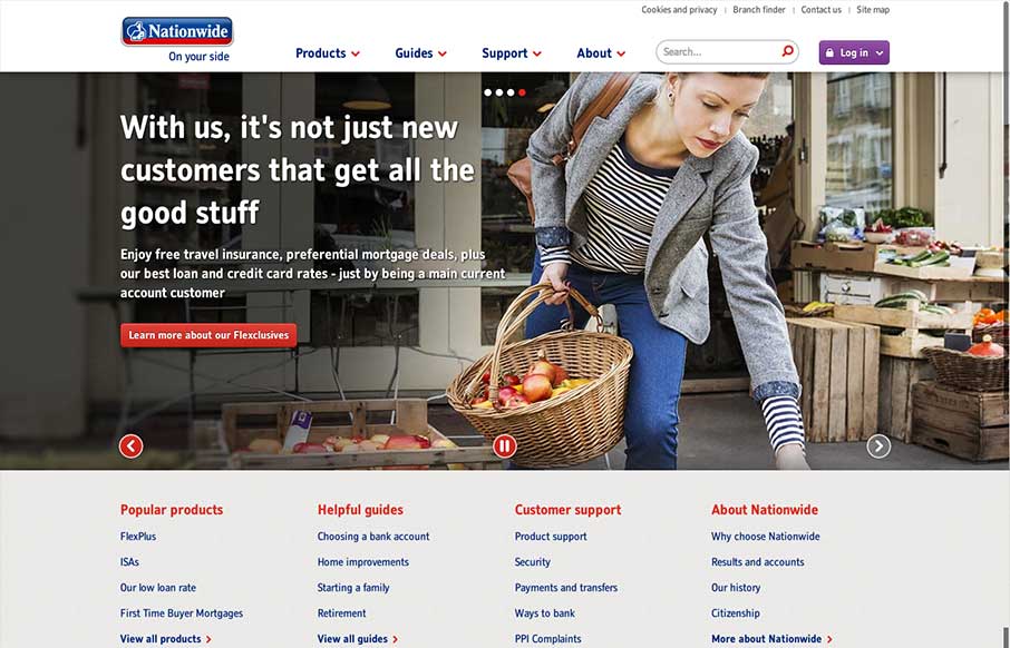
In comparison to other major banking websites (in the UK at least) the recently re-designed Nationwide website is brave and modern. There’s nothing particularly fancy about it which in a way is what you’d expect and want from a website such as this. It is however well spaced out, easy to navigate, responsive and includes a home page that isn’t trying to sell things to you from all directions. I also think the way you get to the third level navigation is pretty neat on the small screen.
The only negatives would be that perhaps it feels too friendly and simple with the large images, rounded corners and rounded fonts. I think this would be a bit picky though!!


Agreed. A nice design. Being picky, the main heading could be few points bigger with a tighter line height.