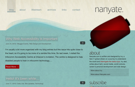
Love the textures and really love the colors. The red and the pattern in the, what I assume is a light of some kind, in the top right illustration under the logo is superb. I love the richness in this design, even though the rest of the colors and textures kind of blend together it just has a nice deep quality to it.
Glassmorphism: The Transparent Design Trend That Refuses to Fade
Glassmorphism brings transparency, depth, and light back into modern UI. Learn how this “frosted glass” design trend enhances hierarchy, focus, and atmosphere, plus how to implement it in CSS responsibly.


0 Comments