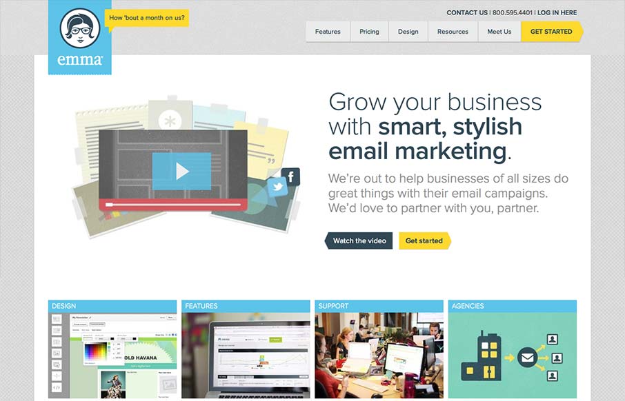
The emma website is very crisp. I dig that top nav and how crisp and brite it looks to me. The “get started” call to action is easy to find and understand and I like that it’s echoed on the page a couple of times. The overall layout gets more dense with content as you move farther down the page but that’s how it should be I think for a product like this.


The Call to Action, Revisited
The Call to Action hasn’t changed in a decade, but the bar has. A fresh look at prominence, copy, mobile tap targets, and accessibility, with lessons from three major design systems.


0 Comments