
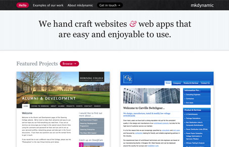
This is a really great simple website design. There’s not much here content wise but what’s here is handled with care. The double screenshots on the home page and the three column treatment on the about page are all nice touches. I also really like the no-nonsense “get in touch” form design too.


Fitts’s Law: Why the Easy Button Wins
Large, close targets are faster to hit than small, distant ones, that’s Fitts’s Law. A look at the 1954 rule behind buttons, prime and magic pixels, thumb zones, and dark patterns.


0 Comments