
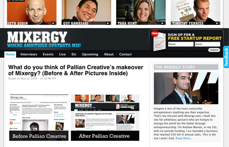
Mixergy is sporting a redesign these days and it’s a vast improvement. This design, as odd as it is to say for a blog, really puts the content/articles front and center. They are the central part of the site so they should get all the attention right? The header is also cleanly organized and streamlined with the site’s top interviews featured right there on top of the page. That’s a really good move visually because those are instantly recognizable people and it immediately draws me right into the site. I’d say this redesign is a success, and the content is top notch stuff to boot.


Fitts’s Law: Why the Easy Button Wins
Large, close targets are faster to hit than small, distant ones, that’s Fitts’s Law. A look at the 1954 rule behind buttons, prime and magic pixels, thumb zones, and dark patterns.


Wow. I’m a regular reader of this blog in my RSS reader. It was so freakin’ cool to see my site featured.
Pallian did a great job on it. I’m so proud of the way it looks.