
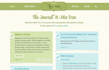
I love the cloth looking textures in this design, they are well done and look convincing yet not over the top too. The colors give this a nice homely feel as well. I like the icon detail work as well, having it go from semi-transparent to solid white background is a nice unexpected little touch.




0 Comments