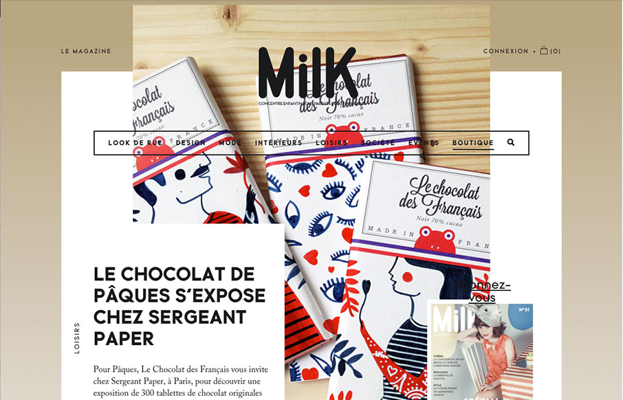
Slick yet simple approach to the layout for Milk Magazine. I love how the main/top section has some overlapping elements like that, then the nav slides up and locks into place as you scroll down. It all fits together and “feels” very purposeful.
Glassmorphism: The Transparent Design Trend That Refuses to Fade
Glassmorphism brings transparency, depth, and light back into modern UI. Learn how this “frosted glass” design trend enhances hierarchy, focus, and atmosphere, plus how to implement it in CSS responsibly.


0 Comments