Submitted by: Mihai Balea @bomasmd
Role: Designer & Developer
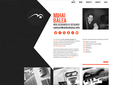
Simple and modern design using HTML5/CSS3 and jquery.
This is pretty straight forward in terms of personal sites, but there’s nice attention to detail and interactions throughout. There’s also a nice use of color and shape here. I dig the background image and how it forces the layout to seem a bit more interesting. The portfolio section is laid out well, though it might be nice for there to be a bit more distinction between the overview text and the rest of the copy on the page.


Nope. Didn’t even bother to view the website because of the loading time. A combination of learned attention deficit disorder, and a personal hatred of load time resulted in me not bothering to view what could have been an amazing site.
Yeah, it’s unfortunate that it took at least 10 seconds to load anything. I understand the desire to want to reveal something fully formed, to pull the curtain away, so to speak. But the reality is that so many people won’t even bother.
I gotta admit Isaac, I wondered what I was getting myself into when I saw the loader. Back to the Flash days? I even started the review out talking about it – but I scrapped that part. I probably should have kept it in because it’s definitely a negative on this site.
I’m not sure if he fixed this or if it can be accredited to my computer/connection speed, but it loaded for me in under two seconds.