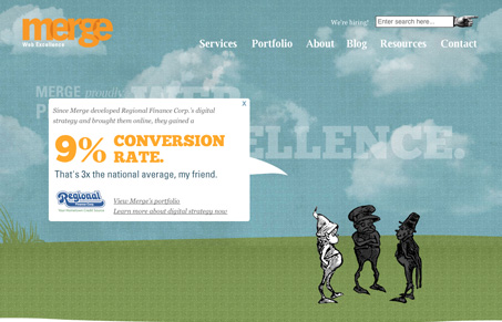
This is a VERY cool looking site! I like how what I call the “company overview” area blends in (or “merges”, ha ha) with the header and navigation. Also, clicking on each little character to see one of the company’s latest accomplishments is a neat idea.
The orange, blue, and green color scheme works really well, the layout guides the eye nicely down the page, and I also like the subtle flash animation of the clouds moving across the landscape. Beautiful web design!


0 Comments