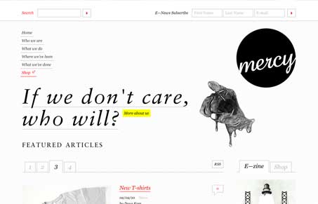
Neat looking website design, I like the start black and with the images here and there. There’s also a lot of javascript access to content, i’m never totally sold on doing that, but in this case it seems to work out pretty well. The typography is pretty clean on this site too, using whitespace well really helps it drive you down the page and take in all the info properly.
Glassmorphism: The Transparent Design Trend That Refuses to Fade
Glassmorphism brings transparency, depth, and light back into modern UI. Learn how this “frosted glass” design trend enhances hierarchy, focus, and atmosphere, plus how to implement it in CSS responsibly.


0 Comments