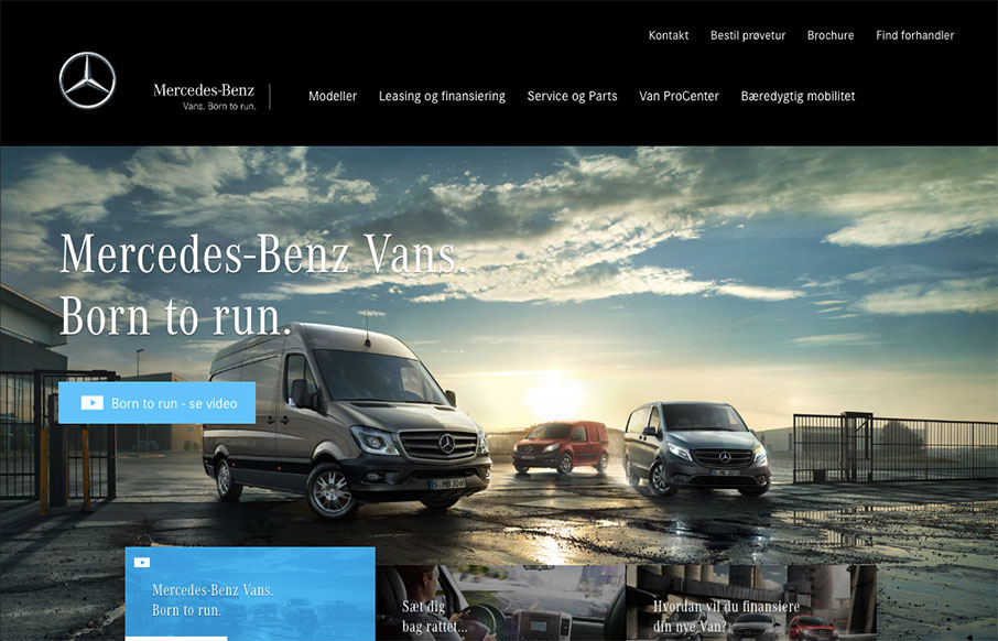
Now something completely different. This is the marketing website for the Mercedes-Benz Vans. It’s pretty straight forward but show’s some pretty good maturity and pacing. I love the lower section of the page as you scroll and the images are on left and right and go back and fourth.
Glassmorphism: The Transparent Design Trend That Refuses to Fade
Glassmorphism brings transparency, depth, and light back into modern UI. Learn how this “frosted glass” design trend enhances hierarchy, focus, and atmosphere, plus how to implement it in CSS responsibly.


0 Comments