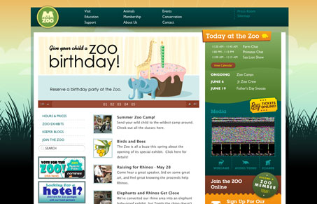
This site has a great color scheme which is used in all elements throughout the site and make it fun and inviting to explore – a good idea for a zoo. The use of columns in the top navigation is different and doesn’t bother me as long as the titles stay short. The subnav is repeated at the top and side which could be repetitive but I think it’s actually pretty useful – opinions?
Glassmorphism: The Transparent Design Trend That Refuses to Fade
Glassmorphism brings transparency, depth, and light back into modern UI. Learn how this “frosted glass” design trend enhances hierarchy, focus, and atmosphere, plus how to implement it in CSS responsibly.


I know what company did the design and they are pretty awesome guys! I really like this design!