
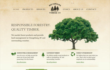
Mctimberco.com is a great little site. It’s a strong synthesis of lush photographic color, texture and well formed typography. Its also a great case-study on simplicity over theatrics. The only detail that somewhat bothers me is the banners, which are a little out of place in this design. They certainly emphasize the headlines but It’d be nice to see a little texture. The banners are the only part of the site that looks like they were made in Photoshop. Still, its a little detail that doesn’t detract from the positive vibe of the site. The consistent use of icons is also a strong feature of the site. Plus, how often do you see “Ethics” as a main nav item??




Very nice; clean and elegant with a two-tone color scheme. I love anything related to forestry and they did a wonderful job. I especially love the tree backdrops int he header, everything comes together nicely.
Actually the web looks basically quite similar to http://oestervangskovbrug.dk.
@Freeze – that’s a stretch. I agree they both have trees, but c’mon.
Well, I have not said any of the two sites to be a copy/inspired. Probably the authors do not even know anything about each other, my point was just the coincidence itself — same menu layout, quite similar heading patter etc.
Sorry if I misunderstood you Freeze. Sounded like what you were saying was they looked the same.