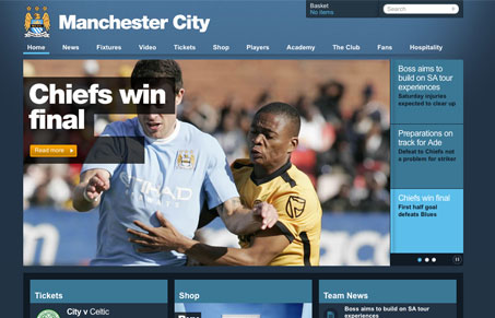
I really love the look of this website. The clean lines and blocky grid look just give it a nice feel. The way the text is overlayed on top of the main image is a pretty good and matching look. The home page is a nice “dashboard” look into the team’s news and events, surprisingly without too much noise in other elements like ads and such. I also really like how they’ve done the shopping cart drop-down in the header.
Glassmorphism: The Transparent Design Trend That Refuses to Fade
Glassmorphism brings transparency, depth, and light back into modern UI. Learn how this “frosted glass” design trend enhances hierarchy, focus, and atmosphere, plus how to implement it in CSS responsibly.


I like the symmetrical grid layout and subtle lighting effects. The design is part of a welcome trend that I’ve noticed; more designs are featuring really large photos, square corners, minimal gradients/dropshadows, and occasional translucent elements.
http://inside.nike.com/blogs/nikefootball-en__EMEA/tags/bootcamp
http://www.mtv.com/?source=CTY_CA
http://www.amctv.com/originals/madmen/
http://smashingmagazine.com
Sites with this style tend to have hip content and cater to web-savvy people. Hopefully laypeople will start to favour this style over the (in my opinion) trite Apple-inspired round corners, gradients, and relfections.
The only complaint I have about the Man City site is that the Arabic-site link is at the bottom of the page. A user who can only read Arabic would want to change the language before doing anything else; so the option should be in the upper righthand corner.
Considering how bad most football websites are, this is a really nice and refreshing change. shame I don’t support man city.