
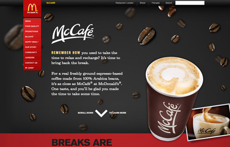
Really cool vertical parallax site design for McCafe®. I love the beans that float around as you scroll and the lower sections’ overlaying each other slightly are pretty well done. It’s nice to see a website for a mega-large organization, even if it’s a smaller section of it, do something like this.




0 Comments