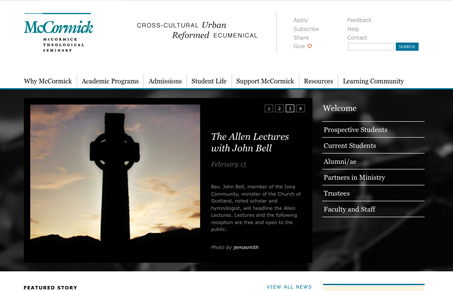
I think this website has somewhat of a corporate undertone, with the use of blue and black and the clean tight lines/grid. It his quite well organized and really easy to get to what your seeking for. I quite like the design, it’s a nice blend of using whitespace as well as you can and sticking with a nice solid grid, especially in the header and footer areas.
Mastering Grids in UI Design: The Backbone of Visual Harmony
A modern guide to UI design grids, learn how to build flexible 12-column and 4-column systems, master margins, gutters, and modules, and apply today’s responsive layout best practices.


0 Comments