Submitted by Matthew Budd, @matthewbudd. Designer & Developer.
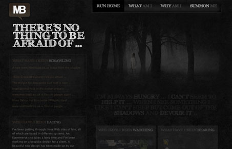
Original dark and creepy design, stands out from the crowd and uses a lot of modern techniques to make the design look great but also make the content very accessible.
Sufficiently creepy is what Gio and I thought, check out our video review to hear it. Overall great effect with the dark on dark design, spooky. I like the effect of the highlighting elements a lot on this site, it seems to make things just explode off the page. Nice techniques used to implement those too. There’s a couple areas, that since the rest of the site is so well done, stand out like the contact form in the footer, the fields don’t fully read visually as fields like the full on contact page does (which is really great.) All in all, we liked this site a lot.


0 Comments