Screencast Review

markboultondesign.com

markboultondesigncom

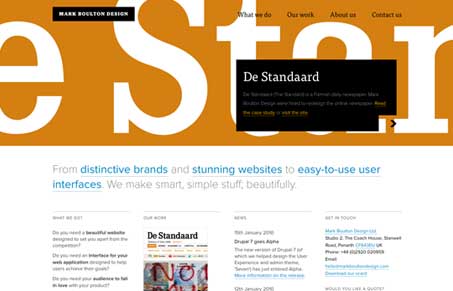
Loving the new Mark Boulton Design website, we loved it so much we recorded a screen-cast review of it. The typography is of course immaculate and it goes without saying that this design uses a strong grid system, it’s actually a clinic in both departments. The site is both thorough and well crafted design.

This site lacks a lot the common trends we’re seeing a lot of, the scrolling javascript animations, and overly self congratulating, overly big header tag-line, and it’s worth studying in detail. This site is the quintessential modern website update, but with all the things that make up timeless quality in a design and I think it’s a least a “bar setter” for the industry, while not being overly designed. That may sound like a lot of bunk, sorry for that, but really study it, it grows on you at just how solid it is.


markboultondesigncom

Loving the new Mark Boulton Design website, we loved it so much we recorded a screen-cast review of it. The typography is of course immaculate and it goes without saying that this design uses a strong grid system, it’s actually a clinic in both departments. The site is both thorough and well crafted design.

This site lacks a lot the common trends we’re seeing a lot of, the scrolling javascript animations, and overly self congratulating, overly big header tag-line, and it’s worth studying in detail. This site is the quintessential modern website update, but with all the things that make up timeless quality in a design and I think it’s a least a “bar setter” for the industry, while not being overly designed. That may sound like a lot of bunk, sorry for that, but really study it, it grows on you at just how solid it is.

Kinsta

3 Comments

  1. Chris Brauckmuller

    You guys are absolutely right. I think that Mark Boulton is one of the strongest Web designers out there right now.

    Reply
  2. Andrew

    I really like this redesign, as you say the crisp typography and clean layout are brilliantly done. However I find going from the homepage to sub pages slightly jarring, the sudden disappearance of such a major element as the header made me initially think the page was broken, I find the header a little lacking in balance on these pages.

    Reply
  3. tony m

    it’s very similar to edenspiekermann.com which has been live since jan 2009

    Reply

Submit a Comment

Your email address will not be published. Required fields are marked *

Time limit exceeded. Please complete the captcha once again.

News & Articles

The Call to Action, Revisited

The Call to Action, Revisited

The Call to Action hasn’t changed in a decade, but the bar has. A fresh look at prominence, copy, mobile tap targets, and accessibility, with lessons from three major design systems.
