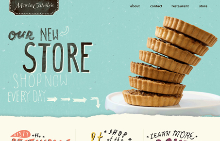
This site is simply beautiful. The texture, the type, the interactions, it’s all there and it’s great. For once here’s a great restaurant/food website and the menu isn’t a PDF or a flash page. Every section is integrated well into the overall design too.
Glassmorphism: The Transparent Design Trend That Refuses to Fade
Glassmorphism brings transparency, depth, and light back into modern UI. Learn how this “frosted glass” design trend enhances hierarchy, focus, and atmosphere, plus how to implement it in CSS responsibly.


Love this website! This is great restaurant in my hometown of Grand Rapids, MI — glad to see they shelled out for such a unique site to match their awesome food.
I don’t see a designer credit, however. Anyone know what firm did this?