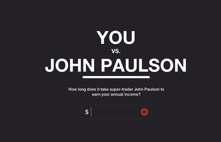
This is a ridiculously clever site. I like the interactive infographic style, and I think the entire architecture of the site is really engaging. The aesthetic and functionality is superbly executed. Marketing gets an “A” for this concept. You really just need to check it out for yourself.


It functions like an interactive infographic, reads like 99% occupy wallstreet marketing, and is pretty impressive all around… but it’s kind of a sucker punch to realize it’s an ad for an upcoming trading app.
so they succeeded in producing something impressive that’s being shared, but at least for me it conjures up all the opposite emotional reactions that they’re hoping for.
all around i think slaveryfootprint.org kills it while biting off a MUCH more complicated project, set of algorithms, and issues. did they get any UMS accolades yet?
Hi Jonah,
I agree with you 100%. I think this is a great point to make when thinking about emotional design approaches. Make sure and take into account ALL the emotions we’re going to feel when experiencing your website. Like the let down that it’s for trading and not something more socially uplifting – or even political…
That Slavery Footprint site is great. I hadn’t seen it yet though, just put it in our review queue too! Thanks!
np
and i agree on all counts.