
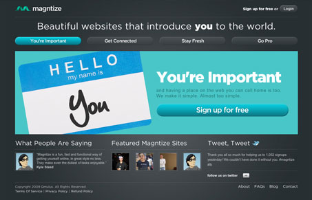
I like this rather simple looking website design. The colors are interesting, with the dark gray and almost turquoise blue coloring. As much as I like the design though, I have no idea what this is. There’s really no identifying copy on the site as to if it’s a product or service, it’s all sort of vague.




I had the same exact feedback when I first saw this site. It looks great but I couldn’t for the life of me figure out what it was for
Hey Guys, thanks for the feedback. We’re looking into clarifying our home page to make sure it’s crystal clear what we’re about. Basically, our app lets people launch personal websites (on their own domain) within a few minutes.