
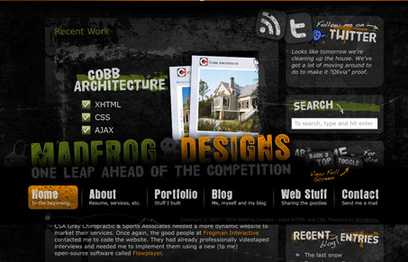
This site has all sorts of crazy stuff going on, from the static footer to the semi-transparent images it’s unique. I think there is definitely some areas of this website where users could get lost or not know what to do. Is it possible there’s too much going on with this website and what makes this different from a traditional flash based website? What do you think of the user experience of this site design?


Fitts’s Law: Why the Easy Button Wins
Large, close targets are faster to hit than small, distant ones, that’s Fitts’s Law. A look at the 1954 rule behind buttons, prime and magic pixels, thumb zones, and dark patterns.


0 Comments