
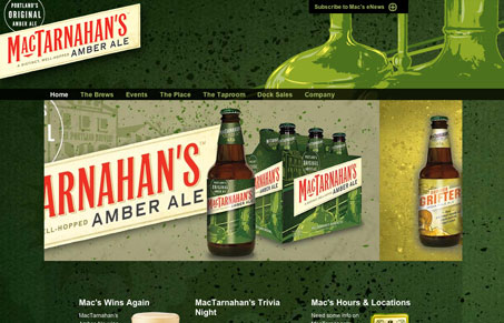
This site has some really cool things going on, the background is very rich and I love the green colors paired with the red. The navigation is really flat and boring, that could really be cleaned up and given some love to possibly push this design into the great category.


Fitts’s Law: Why the Easy Button Wins
Large, close targets are faster to hit than small, distant ones, that’s Fitts’s Law. A look at the 1954 rule behind buttons, prime and magic pixels, thumb zones, and dark patterns.


0 Comments