
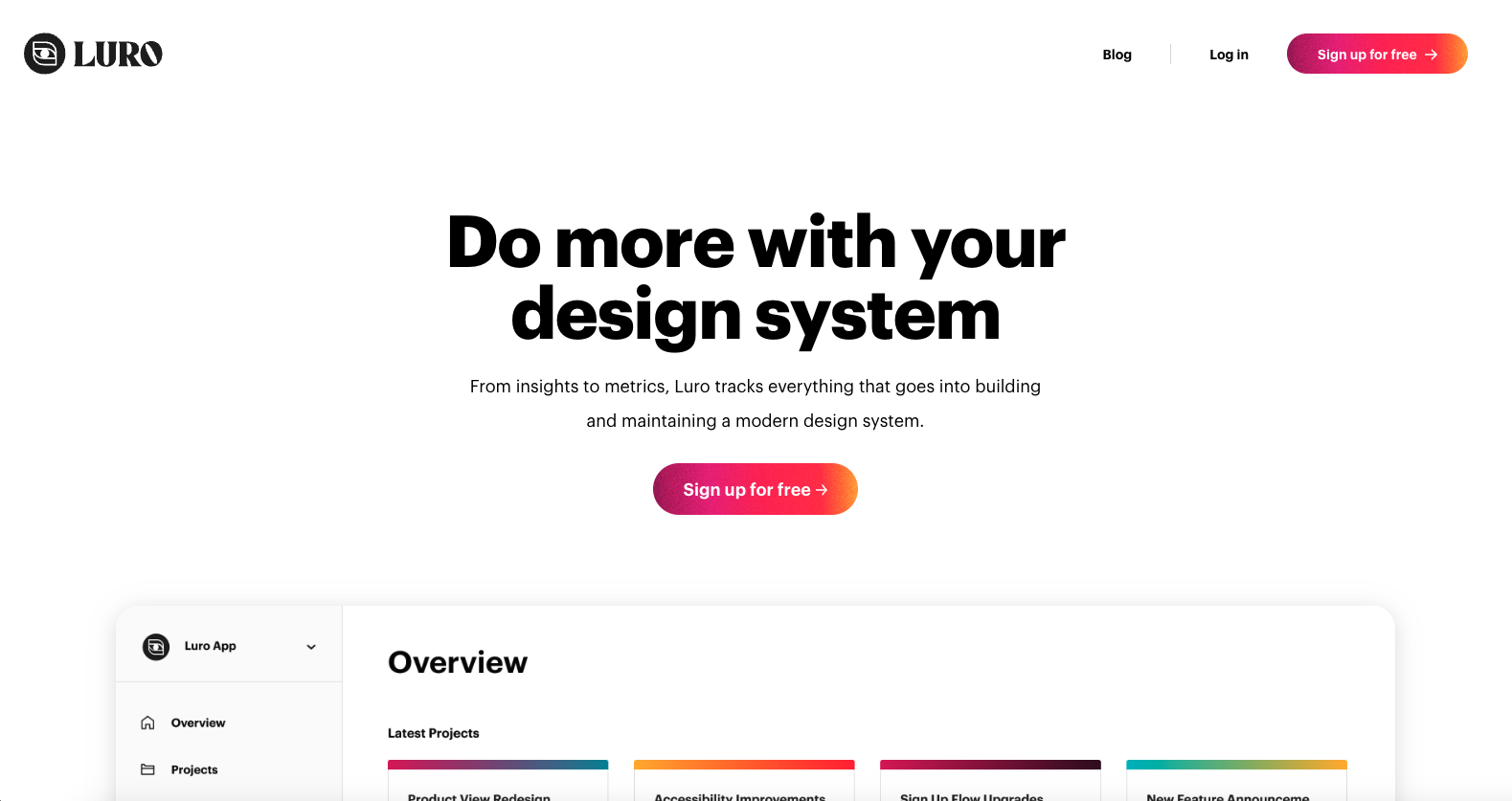
The Luro website uses great type headline to body text weight differences to make it super scan-able. Then it balances the images very well as you scroll down the page to give you a nice sense of visual blocking to take the app in and understand what it’s all about.


Fitts’s Law: Why the Easy Button Wins
Large, close targets are faster to hit than small, distant ones, that’s Fitts’s Law. A look at the 1954 rule behind buttons, prime and magic pixels, thumb zones, and dark patterns.


0 Comments