
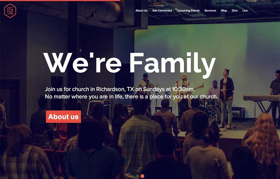
The loftcitychurch site strikes a wonderful balace between it’s use of images, typography and color. At large screen sizes the site feels big and open, which is perfect for a church, and at mobile sizes everything feels compact but not cramped. The use of fixed background images is really nice because of the ‘reveal’ effect that it creates.


Fitts’s Law: Why the Easy Button Wins
Large, close targets are faster to hit than small, distant ones, that’s Fitts’s Law. A look at the 1954 rule behind buttons, prime and magic pixels, thumb zones, and dark patterns.


0 Comments