Submitted by Steve Verlinden, @verlinden. Developer.
LiveResto is an online platform allowing the creation and the management of restaurants websites.
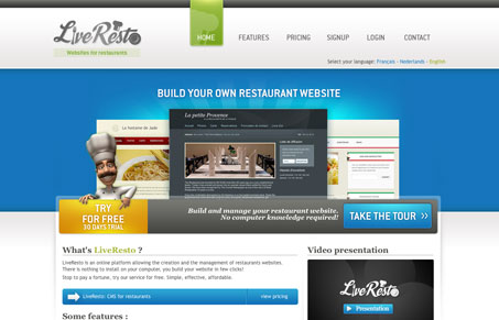
I like the big image area with the three images of sample websites .The navigation design is pretty good too, with a big green image as the on state it’s hard to miss what page you’re on. I’m not digging the chef illustration all too much, but it does break up the clean design well. This design is thorough and complete with the rounded corners on the form elements.


Typographically, this site is a mess. I count about five different typefaces, plus different weights, on the home page. If you draw a line under the ‘Try for Free/Take the Tour’ area, it appears as if the stylesheet is turned off. There doesn’t seem to be logical hierarchy to the fonts or weights chosen. The type issues are compounded by the lack of any consistency in alignment. Most text is left aligned, but then there are some elements that are floated right and some that are centered. It all adds up to a jumble.
This site could really be helped by following a couple of simple rules. Stick to two typefaces, not necessarily counting the logo and try to keep everything aligned as much as possible. Once those are working then those rules can be broken, but starting there is an good way to achieve consistency.