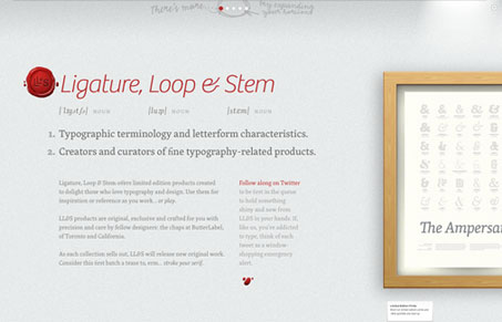
I love the look and feel of this website, the typography is really great. The detail is superb. What I think is problematic is the side scrolling feature, the little dots at the very top are not quite as obvious as maybe they should be. There’s not much that isn’t beautiful visually speaking on this design though.
Glassmorphism: The Transparent Design Trend That Refuses to Fade
Glassmorphism brings transparency, depth, and light back into modern UI. Learn how this “frosted glass” design trend enhances hierarchy, focus, and atmosphere, plus how to implement it in CSS responsibly.


First off – thanks for adding out little experiment!
We’ve been toying with some other ideas for dealing with the navigation issue mentioned. A big part of the site was that we didn’t want to limit ourselves by conventional ideas for navigation, particularly since the site’s needs are fairly modest at the moment. That said, there’s definitely room for improvement while still allowing for the “cleverness” or”interestingness” we were looking for. Changes will likely shake out once we’re ready to roll out the next set of products which, due to other obligations has been taking longer than we hoped for. Again, thanks for adding LL&S!
Hey Scott, You got it man, it’s a nice looking design.
I think the navigation “works” just more that it’s not obvious enough, maybe something as simple as making it bigger or bolder would make it more functional. It’s just a little hidden against the rest of the elements on the site.
Keep us in the loop on when you’re rolling out new products too will you? I can’t wait to see it.