
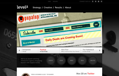
There are lots of little specific things I like about this website. The fixed header design, the way the blog display on the home page uses a circle to hold the head shots of the post’s author. The skills display area, where the specific things this firm can do for you are highlighted when you mouse over each circle. Then there’s the about page, with the slidshow like slider that you use to navigate through the team members – that’s my favorite part.




0 Comments